Rethinking Mastodon's post visibility UX
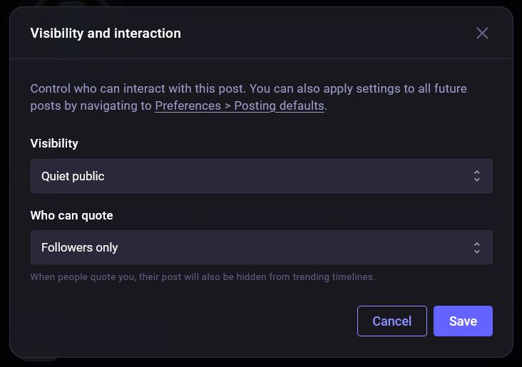
current implementation post visibility selection dialogue
This weekend, something out of Mastodon's web UI caught my eye. As a maintainer of small user-facing products, I am always looking for ways to reduce friction in interaction patterns. The newest update brings a long-awaited 'quote post' feature. The implementation adds some interesting UI challenges regarding post visibility.
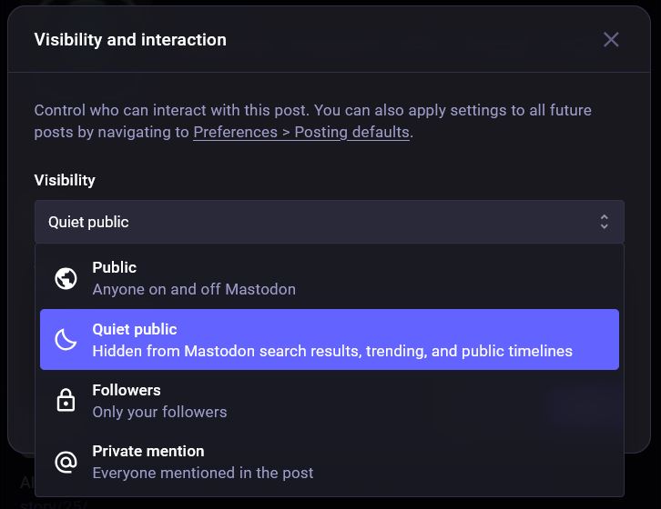
The current modal design (shown above) relies on dropdown menus for both visibility and quoting permissions. This implementation uses standard UI patterns that are reliable and accessible. However, as an exercise in interaction design, I wanted to explore how I can optimize these workflows for higher discoverability. Currently, on the web UI, if you wanna change the post-privacy or who you allow to quote your post, the current workflow is something like :
- click the button on the compose box to open the modal
- click to open the the first dropdown
- select the option you want
- click to open the second dropdown
- select the option you want
- click save
There are a total of four options for post privacy, each with a one line explanation, and three options for who can quote you. Got me thinking that this finite set of options makes it a good candidate for bubbles aka choice chips, as Google calls them, in place of the current dropdown.
By exposing these options upfront, we reduce the interaction cost. Users can scan all available options instantly without another interaction. The modal below is interactive and I've tried to make it accessible. The chips are built on top of radio inputs and CSS handles the styling based on the input selected. Javascript handles the subtext changes depending on the content.
Visibility and interaction
Control who can interact with this post. You can also apply settings to all future posts by navigating to Preferences > Posting defaults.
Visibility
Who can quote
Interactive Demo.
Unlike the rest of the website, this demo requires JS enabled if you wanna be able to click around. This little change reduced one extra step of clicking a dropdown and selecting an option. Now,
- click the button on the compose box to open the modal
- click first bubble
- click second bubble
- click save
This reduces the interaction cost. According to the nngroup, this is the sum of efforts - mental and physical - that users must deploy in interacting with a digital product in order to reach their goals. Here the goal being, changing visibility settings.
The chips allow users to recognize the right option immediately rather than having to discover what might be inside the dropdown.
While we're out here experimenting, I also considered the workflow for setting defaults. Currently, changing the default setting requires context switching away from the composer into the preferences menu. Adding a 'save as default' action directly within the modal keeps the user in their flow, allowing them to update their preferences contextually. Wouldnt that be a bit nicer?
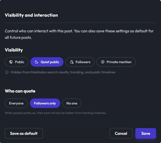
Screenshot showing new placement of the save as default button.
The addition of the button is meant to address a common friction point called context switching. In the current design, if a user realizes, "I always want to post to Followers only," they have to abandon their current post, navigate to the preference, save it and come back. Instead, we now allow users to set their preferences in the flow.
As an end user, it is these small things that often define how fluid a website or an application feels. While I love diving into these UI challenges in my spare time, it is the first time I'm writing about it here. If you read this far, thank you. I am also curious to hear your take: does the chip-based layout feel more intuitive or is there an accessibility or scalability argument for keeping the dropdowns that I've overlooked?